Joining ‘f’s and ‘t’s
According to Wikipedia:
Many ligatures combine f with the following letter. A particularly prominent example is fi. The tittle of the i in many typefaces collides with the hood of the f when placed beside each other in a word, and are combined into a single glyph with the tittle absorbed into the f. Other ligatures with the letter f include fj, fl, ff, ffi, and ffl. […] These arose because with the usual type sort for lowercase f, the end of its hood is on a kern, which would be damaged by collision with raised parts of the next letter.
However, I used another method to join the bars in ff, ft, tf, and tt in a personal fork of Gentium.
I believe that approach is quite different from ligature, both visually and conceptually.
What I need is something similar to joining strokes in a cursive typeface.
It is merely designed for visual comfort without any semantic information, thus being semantically transparent and visually natural.
Take a look at the demo:

At first sight, a joint is hopefully not too obvious, at least less visible than most ligatures.
For example, the first f in an ff ligature tends to be smaller than the second in many typefaces.
That looks smart probably, but is not what is wanted here.
It is intentionally designed to be subtle, so I am not so interested in an fi ligature.
It is difficult not only to keep an fi ligature visually subtle but also to tell if the i is dotless or not.
That will cause serious problems in some writing systems, like Turkish.
And in writing systems such as German, where the usage of ligatures is somehow involved in orthography, ligatures will generally become quite troublesome for either users or developers, or both.
How did I implement that? First, we need three variants for each letter: prefix, infix, and suffix. For example:
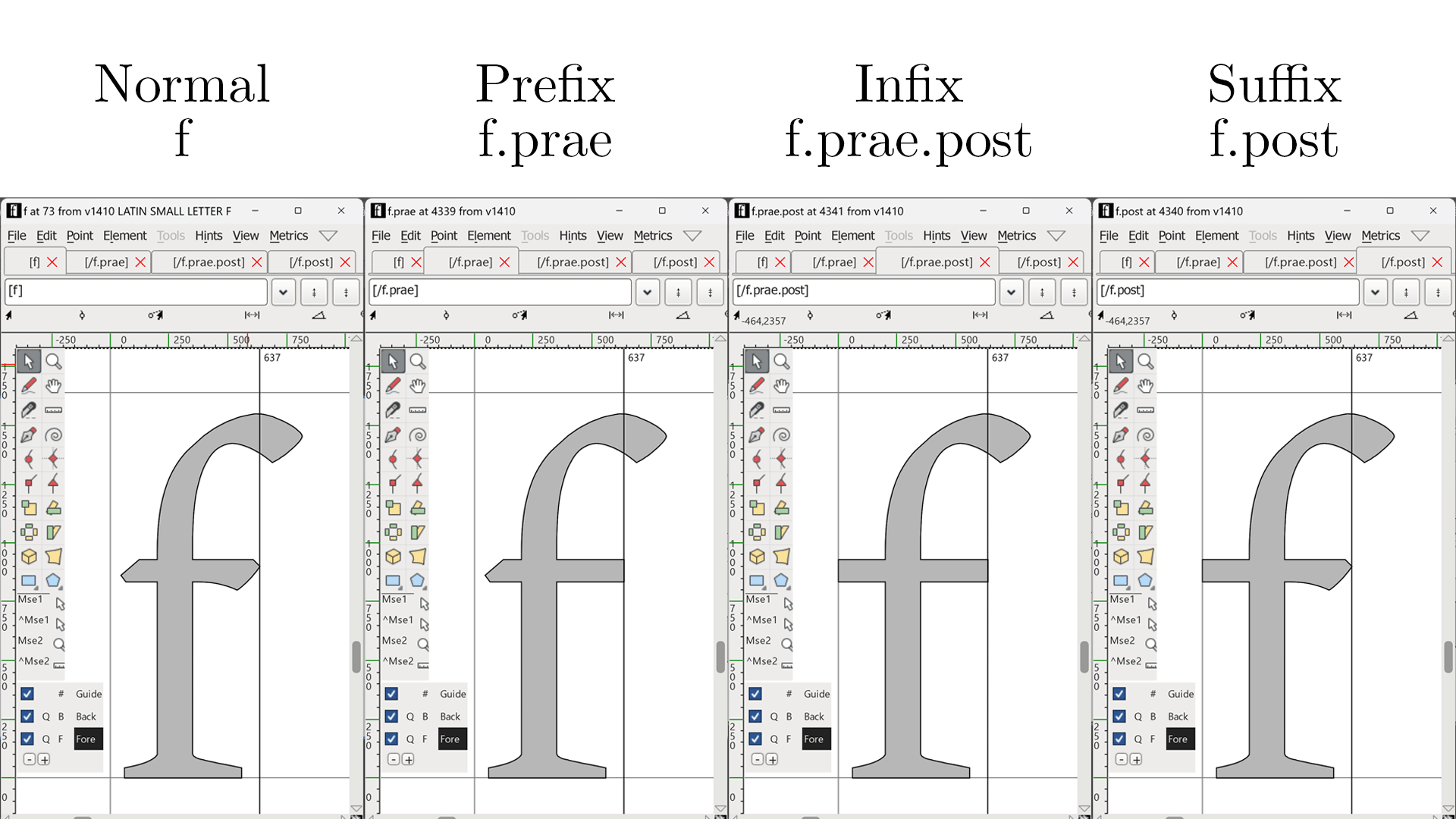
I should explain those weird codes.
A letter with prae is joined with the next letter; one with post is joined with the last letter.
An infix, therefore, is with both prae and post.
That naming convention turns out to be convenient when creating lookups of Character Variants.
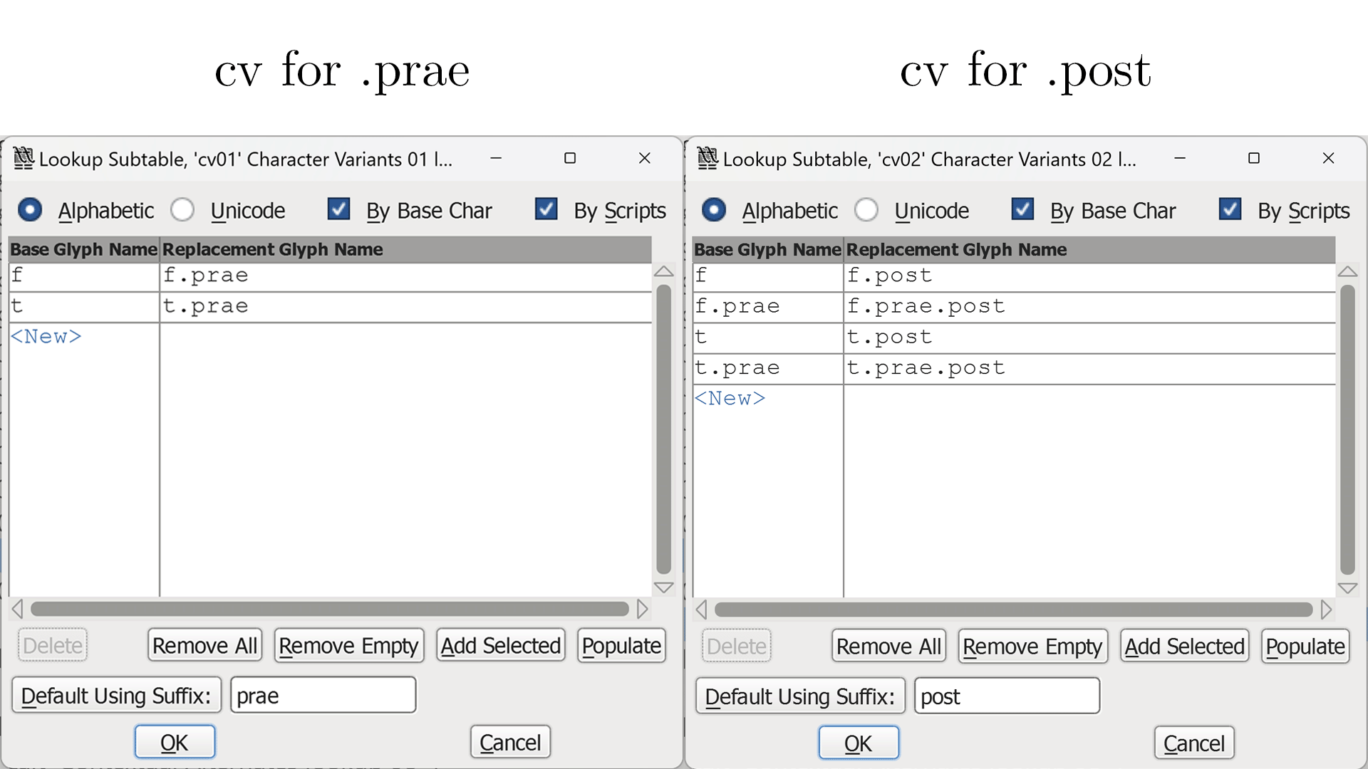
With those lookups, we can implement the substitution.
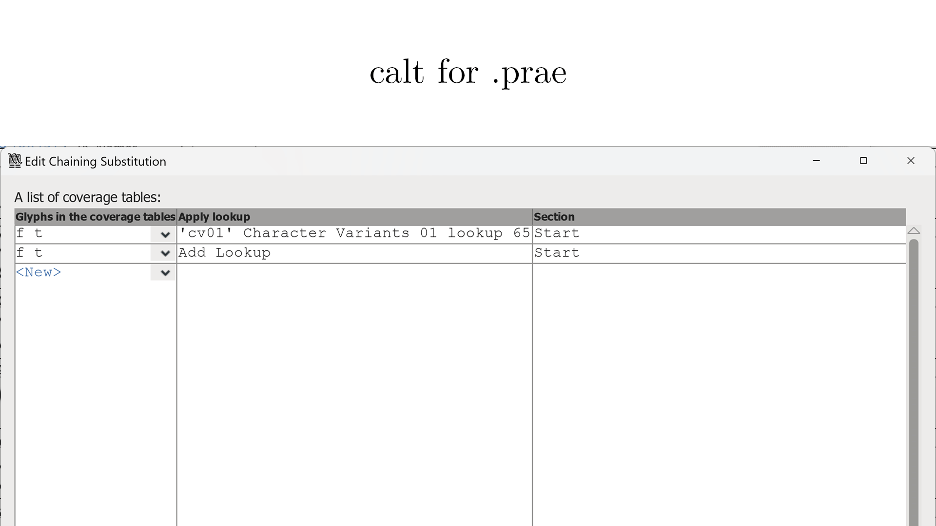
The type of substitution we need is called chaining contextual substitution.
It happens in two steps, with two lookups of Contextual Alternates.
First, an f or t followed by another f or t becomes prae, with the help of the cv lookup for prae defined above.
The first calt lookup is something like this:
The second step is a little complex since we now have not only fs and ts but also f.praes and t.praes.
Such a letter following another variant of f or t becomes post, with the help of the cv lookup for post defined above.
The second calt lookup is something like this:

With the four OpenType lookups above, I got the feature I want.
Since I worked on that in July 2020, almost three years ago, I have forgotten some details, especially how I created those lookups in FontForge. In addition, I never fully understand the mechanism of substitution. Therefore, the implementation above may have issues in some edge cases. Hopefully, I will learn the OpenType format someday and implement the feature without the help of FontForge.